CASE STUDY: Designing The Universe Is Absurd Poster: From Concept to Campaign (2026)
- Luciana Machado

- Mar 16
- 3 min read
Updated: Apr 17
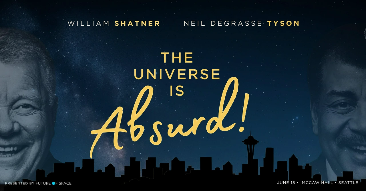
The Universe is Absurd! with William Shatner and Neil deGrasse Tyson is back for a second run in 2026, this time in Los Angeles. The poster I designed is front and center of the campaign.

Designing The Universe is Absurd Poster: From Concept to Campaign
Key art is the first thing that makes a stranger stop scrolling. For The Universe Is Absurd! with William Shatner and Neil deGrasse Tyson, that's a harder brief than it sounds. You've got two very famous men who are famous for completely different reasons, a show title that is doing a lot of heavy lifting, and an audience that probably knows one way better than the other. The poster had to earn attention fast.
So I started where I always start: what do people already know.
My first instinct wasn't 'let's make them look like a fun duo.' It was actually the opposite.
Because here's the thing about Shatner and Tyson: they don't agree. That's the show. One of them finds the universe miraculous and the other finds it terrifying, and they've basically been having the same argument since they got stuck on a boat together in Antarctica. So putting them in a warm, buddy-comedy frame felt dishonest. I wanted the image to have some friction in it. Two people who are clearly in the same frame but not necessarily on the same side. The pose came from that instinct.
Live and Let Laugh: The Bond Reference

From Decorative Spiral to Conceptual Black Hole
Once I had them in tuxedos and facing slightly away from each other, the James Bond thing was kind of inevitable. The composition was already going there. Spiral, two figures, formal wear, something vaguely cinematic and self-serious. Bond has owned that visual for six decades.

But the show isn't self-serious. It's absurd, it says so in the title. So the challenge became: how do you use that reference without becoming it? Live and Let's Laugh was the line that made it click for me. Same rhythm as the original, but it lets you know something's being gently roasted. I tried a few of variations. None of them had weapons. A gun in either of their hands would have been completely wrong for what this show actually is.

The classic Bond spiral is gorgeous but it's basically wallpaper. It doesn't mean anything, it just looks cool and draws your eye in. For a show literally about two people arguing over whether existence makes sense, I thought we could do better than decorative.
A black hole made more sense. Not just visually but conceptually. It's a place where physics stops working and nobody really knows what happens next, which is honestly a solid metaphor for the whole show. I went through a lot of versions getting the vortex to sit right, because there's a difference between a spiral that's behind the subjects and one that feels like it's actually pulling them in. The second one tells a story. That's the one I wanted.

What Happened Next: From Unused Concept to Campaign Centerpiece
We didn't end up using it for the original run. The creative direction shifted and it just didn't fit where they landed. That happens.
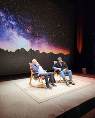
What happened after is that the follow-up promotional material for the new run of The Universe Is Absurd! with William Shatner and Neil deGrasse Tyson sits on the exact same visual foundation. The tuxedos, the vortex, the two-figure composition. It's my concept and my execution, now out in the world with some font choices I would absolutely not have signed off on.

The universe is absurd. The creative industry sometimes is too.


Comments